

FREE PALESTINE - ONE YEAR OF GENOCIDE
French version un peu plus bas!
This movie is a visualization of a message, it’s strictly sticking to its duty: to be a slogan made of slogans.
It’s clear, too clear, which is why it got the best screenplay at Cannes. It’s schematic, it’s didactic, it’s bold typography and it's not at all like a maze.
It talks about a deep subject and subtracts all of its depth to it. It takes all the elements and neatly disposes them on a table next to each other. Then, the writer, Coralie Fargeat, mildly thoughtfully touches their chin before carefully laying a path for the viewer.
The voice of a mothering tour guide is talking you into each step of the story:
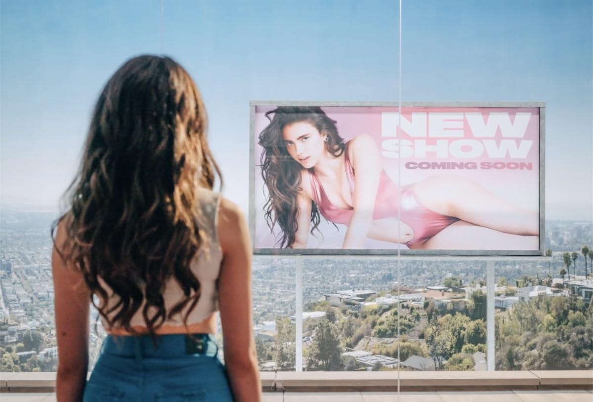
“So now be careful, because she’s about to see the billboard in front of her house and feel bad about herself, watch out for her eyes, they are full of something called: self-hatred!… repeat after me everyone, self-hatred!… great. Now, look out for the signs that say “eating disorder” - look out for things like, puking, hair pulling, and crying.. oh here comes another crucial moment, a big sign of self-hatred is the TV.. look at how she turns it on, all alone in the dark.”

And just like that, the didactic authority of the American script (written by a French woman) guides you like a child on a very long autopsy table. Of course it goes hand in hand with the Gym font, which is half criticized and half fetishized - another unmistakable trait of the graphic designer’s personality. We hate Uber but we respect Uber for their branding, true humility.
So there I was having fun in the neo-romantic/neo-expressionist desire for a cathartic all-out splish splash - including some references to the Shining !!! Of course, the fx had sculptural qualities - the monstro Suelizabeth wears a dress that covers the open mouth of Elizabeth, what a beautiful idea (not ironic).
I was having fun in my corners, trying to avoid the complete absence of mistakes - which was a huge mistake in itself, such an alienating cleanness.
The macro shots could have brought beauty to the movie, the detail and the audio effects could’ve been unpredictable. But they only serve the same purpose as signalization on the road. Dead shrimp = evil guy.
All and all I could summarize this project by framing it as a giant ad. A super long and well-oiled advertisement that will pass on TV for a few months.
Sacre
Ce film est la visualisation d'un message, il s'en tient strictement à son devoir : être un slogan fait de slogans.

C'est clair, trop clair, et c'est pour cela qu'il a reçu le prix du meilleur scénario à Canes. C'est schématique, c'est didactique, c'est une typographie en gras et pas du tout un labyrinthe.
Il parle d'un sujet profond et lui soustrait toute sa profondeur. Il prend tous les éléments et les dispose proprement sur une table, les uns à côté des autres. Ensuite, l'auteure, Coralie Fargeat, se touche légèrement le menton d'un air pensif avant de tracer soigneusement un chemin pour le spectateur.
La voix d'un guide touristique maternant nous guide à chaque étape de l'histoire :
"Alors maintenant, attention, parce qu'elle va voir le panneau d'affichage devant sa maison et se sentir mal dans sa peau, regardez ses yeux, ils sont pleins de quelque chose qui s'appelle : la haine de soi !... répétez après moi tout le monde, la haine de soi !... super. Maintenant, faites attention aux signes qui indiquent un trouble de l'alimentation : vomissements, cheveux tirés, pleurs... Oh, voici un autre moment crucial, un grand signe de haine de soi est la télévision... Regardez comment elle l'allume, toute seule dans le noir."
Et juste comme ça, l'autorité didactique de l'écriture américaine (écrite par une Française) vous guide comme un enfant marchant sur une très longue table d'autopsie. Bien sûr, cela va de pair avec la police d’écriture très Salle de Muscu, qui est à moitié critiquée, à moitié fétichisée - un autre trait caractéristique de la personnalité des graphistes. Nous détestons Uber mais nous respectons Uber pour son image de marque, la vraie humilité du graphiste.
J'étais donc en train de m'amuser avec le désir néoromantique/néo-expressionniste d'une éclaboussure cathartique - y compris quelques références à Shining !!! Bien sûr, les effets ont des qualités sculpturales - le monstre Suelizabeth porte une robe qui couvre la bouche ouverte d'Elizabeth, une très bonne idée (premier degré ici).
Je m'amusais dans mes petits coins, essayant d'éviter l'absence totale d'erreurs dans ce film - ce qui était une énorme erreur en soi de la part de ses créateurs, tant cette propreté est aliénante.
Les plans macro auraient pu apporter de la beauté au film, les détails et les effets sonores auraient pu être imprévisibles. Mais ils ne servent que le même but que la signalisation sur la route. Crevette morte = méchant.
En somme, je pourrais résumer ce projet en le présentant comme une publicité géante. Une publicité super longue et bien huilée qui passera à la télé pendant quelques mois.